
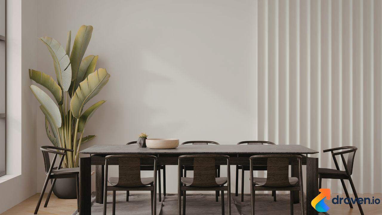
Designers constantly look for efficient ways to add depth, movement, and visual character to surfaces. One of the most powerful and immediate solutions is using patterns. In fact, Patterns Are the Fastest Way to Shift Texture, allowing designers to transform flat, static visuals into dynamic compositions without physically changing the material itself.
Whether applied to digital interfaces, interior spaces, textiles, or branding assets, patterns can instantly modify how a surface is perceived. By layering shapes, repeating motifs, and controlling spacing, designers can simulate texture, rhythm, and complexity. This makes patterns an essential tool in modern visual communication.
Why Patterns Instantly Change Perceived Texture
Texture traditionally refers to the physical feel of a surface, but in design it often refers to visual texture—the illusion of depth and tactile qualities. Patterns play a crucial role in creating this illusion.
When patterns are introduced, they:
- Break up flat surfaces
- Create depth and dimensionality
- Guide the viewer’s eye
- Add rhythm and movement
- Enhance brand identity
Because patterns repeat elements, the brain quickly recognizes structure and variation at the same time. This combination creates the sensation of texture even when the surface itself remains smooth.
The Psychology Behind Pattern-Based Texture
Humans naturally respond to repetition and rhythm. Our brains are wired to recognize patterns in nature—from waves and leaves to animal markings. When designers incorporate patterns into their work, they tap into these instinctive visual cues.
Patterns help create:
Visual Rhythm
Repeating elements produce a sense of movement across a surface, which can simulate the feel of woven fabrics, embossed materials, or layered textures.
Depth Perception
Strategic spacing, scale variation, and contrast can give patterns a three-dimensional appearance, making flat surfaces appear layered.
Emotional Impact
Patterns can influence how users emotionally respond to a design. For example:
- Organic patterns feel natural and calming
- Geometric patterns feel structured and modern
- Irregular patterns feel artistic and expressive
Types of Patterns That Create Texture
Different pattern styles can dramatically change the perceived texture of a design. Each pattern type communicates a unique visual language.
Geometric Patterns
Geometric patterns rely on repeated shapes such as triangles, circles, or hexagons. These patterns are commonly used in digital products, branding, and modern interiors because they convey precision and structure.
They often create the illusion of:
- Hard textures
- Architectural surfaces
- Structured environments
Organic Patterns
Organic patterns mimic natural forms such as leaves, waves, or flowing lines. These patterns tend to produce softer textures and more relaxed visual experiences.
Designers often use organic patterns in:
- Wellness brands
- Nature-inspired packaging
- Interior decor
- Lifestyle websites
Abstract Patterns
Abstract patterns are highly versatile because they do not represent specific objects. Instead, they use color variation, brush strokes, or irregular shapes to create expressive texture.
These patterns are common in:
- Editorial layouts
- Digital art
- Brand backgrounds
- Modern UI designs
How Patterns Enhance Digital Design
In digital environments, designers cannot rely on physical materials to communicate texture. Instead, they must simulate tactile qualities visually. Patterns become one of the most effective tools for achieving this.
Improving Interface Depth
User interfaces often look flat if they rely only on solid colors. Patterns add layers that help differentiate sections, cards, and backgrounds.
Subtle pattern overlays can create:
- Visual hierarchy
- Separation between sections
- Background richness without clutter
Creating Brand Recognition
Brands frequently incorporate signature patterns into their visual identity. These patterns appear across websites, social media graphics, packaging, and marketing materials.
Examples include:
- Fashion brands using repeating monograms
- Tech brands using geometric grids
- Lifestyle brands using hand-drawn patterns
Consistent patterns reinforce brand identity and make designs instantly recognizable.
Supporting Content Without Distracting
A well-designed pattern acts as a supportive visual element rather than a competing focal point. When used correctly, it enhances the content rather than overshadowing it.
The key is controlling:
- Pattern scale
- Contrast
- Opacity
- Repetition density
Subtle patterns can create texture while keeping the main content readable.
Pattern Density and Texture Strength
One of the most important considerations when using patterns is density. Density determines how strong the texture effect appears.
High-Density Patterns
High-density patterns contain closely spaced elements. These patterns create strong texture effects and are ideal for:
- Background surfaces
- Fabric simulations
- Decorative elements
However, they must be used carefully to avoid visual overload.
Low-Density Patterns
Low-density patterns use more spacing between elements. These patterns create lighter textures and are suitable for:
- Minimalist designs
- UI backgrounds
- Presentation slides
- Subtle branding accents
The balance between density and spacing determines whether the texture feels bold or delicate.
Color and Pattern Interaction
Color dramatically influences how patterns shift texture. Even the same pattern can feel completely different depending on the color palette used.
For example:
- Monochrome patterns feel subtle and elegant
- High-contrast patterns feel energetic and bold
- Soft pastel patterns feel calm and minimal
Designers often combine color gradients with patterns to produce layered textures that feel rich but still cohesive.
Patterns in Interior and Product Design
Beyond digital design, patterns also play a major role in physical environments. Interior designers frequently use patterned materials to change the perceived texture of walls, floors, and furniture.
Examples include:
- Patterned wallpapers that simulate fabric or stone
- Textile patterns that create tactile depth
- Tile patterns that add movement to floors
Because of this versatility, Patterns Are the Fastest Way to Shift Texture not only in graphics but also in architecture and product design.
Best Practices for Using Patterns Effectively
While patterns are powerful, they must be applied strategically. Poorly chosen patterns can create clutter or visual confusion.
Designers should follow several best practices.
Maintain Visual Balance
Patterns should complement the layout rather than dominate it. Using negative space helps prevent visual overload.
Adjust Scale Carefully
Small patterns create subtle textures, while large patterns create bold visual statements. Choosing the correct scale is essential.
Use Patterns Sparingly
Not every section needs a pattern. Strategic placement ensures the design remains clean and focused.
Test Across Devices
For digital products, patterns should be tested across screen sizes. What looks subtle on desktop may appear overwhelming on mobile devices.
The Future of Pattern-Driven Texture
Advances in generative design and AI tools are making it easier than ever to create complex patterns. Designers can now generate unique textures dynamically, allowing brands to maintain visual consistency while still exploring variation.
Emerging technologies are enabling:
- Algorithmic pattern generation
- Interactive pattern animation
- Adaptive patterns that respond to user behavior
As design continues to evolve, patterns will remain one of the most efficient and creative methods for transforming surfaces and adding depth.
FAQs
Why are patterns effective for creating texture in design?
Patterns create repetition and variation, which trick the eye into perceiving depth and tactile qualities even on flat surfaces.
Can patterns improve user interface design?
Yes. Subtle patterns can add visual hierarchy, depth, and brand personality to user interfaces without distracting from the content.
What types of patterns work best for digital backgrounds?
Low-contrast geometric or abstract patterns often work best because they create texture while maintaining readability.
How do designers avoid making patterns overwhelming?
By adjusting pattern density, scale, and color contrast, designers can ensure patterns enhance the layout rather than dominate it.
Are patterns useful in branding?
Absolutely. Many brands use signature patterns to create recognizable visual identities across websites, packaging, and marketing materials.
